A brand as polished as the nails.
Nails by Manu needed a look that felt feminine, playful and premium at the same time. We created the logo and brand kit, then carried it into social media creatives, the price list and everything printed for the salon.
Nails by Manu
Nails by Manu is a nail art salon. Its customers choose a salon the way they choose a design: by how it looks. The brand had to feel as considered as the work on their nails.
The ideas behind it
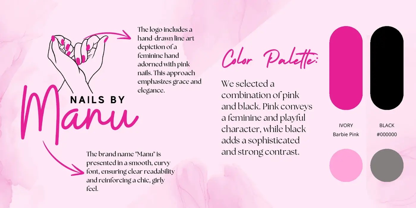
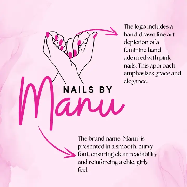
A hand-drawn line art hand with pink nails, drawn for grace and elegance. The name “Manu” is set in a smooth, curvy script that reads clearly and feels chic.
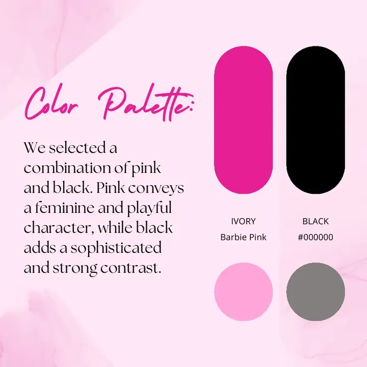
Barbie pink for a feminine, playful character, paired with black for a sophisticated, strong contrast.
Our work for Nails by Manu
- IdentityLogoHand-drawn mark and script wordmark.
- IdentityBrand kitPalette, type and usage rules.
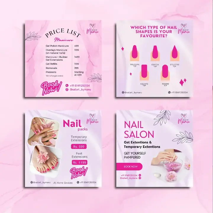
- DigitalSocial media creativesPosts for services, offers and nail art.
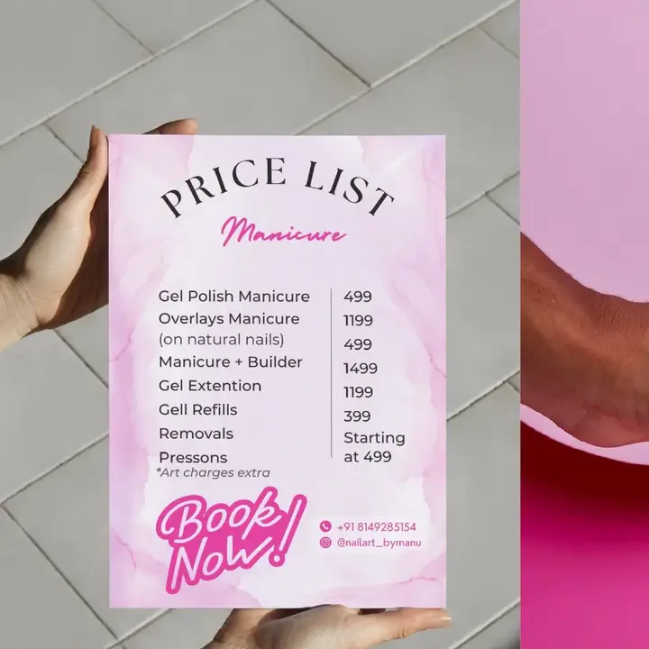
- PrintPrice listManicure, extensions and removals, in the brand look.
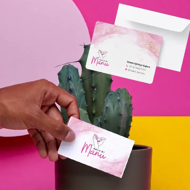
- PrintBusiness cards & printCards and in-salon print items.
See the work
Swipe or scroll sideways to see all five slides.
Want a brand people remember?
Get in touch and we’ll tell you honestly what we’d do first.